| Regional methane emissions - 2003-2012 decade |
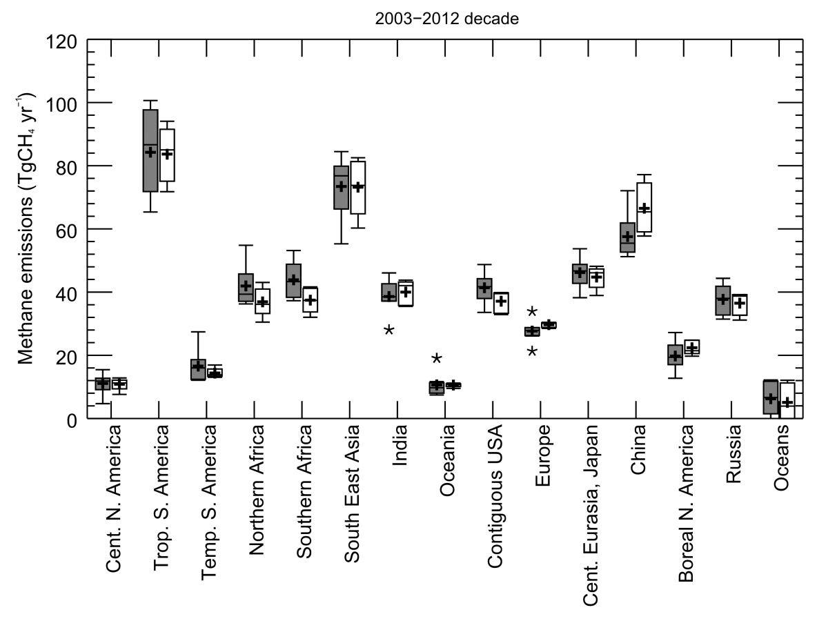
Figure 6. Regional methane emissions for the 2003–2012 decade from top-down inversions (grey) and for the prior estimates used in the inversions (white). Each boxplot represents the range of the top-down estimates inferred by the ensemble of inversion approach. Median value, and first and third quartiles are presented in the box. The whiskers represent the minimum and maximum values when suspected outliers are removed (see Sect. 2.2). Outliers are marked with stars when existing. Mean values are represented with “+” symbols; these are the values reported in Table 4. |
|
| Source: Earth System Science Data |
URL: http://www.earth-syst-sci-data.net/8/697/2016/essd-8-697-2016.pdf
(The text for the image(s) on this Web page was taken from the above source.) |